
The best medals aren’t just manufactured. They’re designed with intention.
So, what makes a medal feel special?
From the first silhouette to the final finish, great medal design is built from a few key elements that separate the ordinary from the unforgettable.
Here’s the anatomy of a truly great medal.
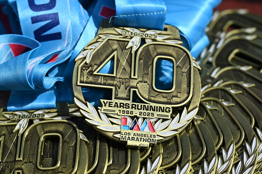
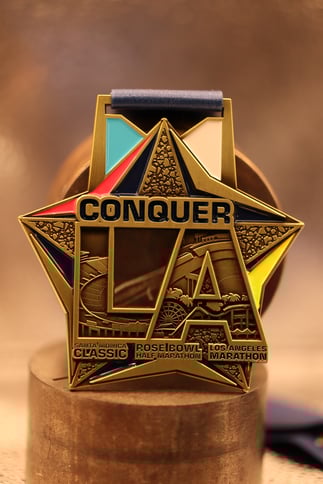
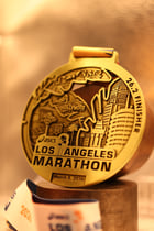
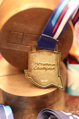
The Silhouette: Shape Comes First
Most medals start as a circle. And there’s nothing wrong with that, the most memorable designs often begin with a distinctive outline.
Custom shapes instantly create character:
- A skyline for a city marathon
- A shield for a championship event
- A starburst for a celebration
- A logo-inspired contour for a branded award
The silhouette is the first thing someone notices, even from a distance. A strong shape makes the medal feel considered, not generic.
But a circle is still a strong premium feel if done right.
Great medal design starts before the details, it starts with the profile.
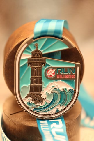
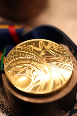
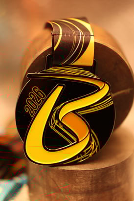
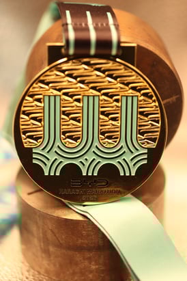
Depth and Relief: Flat vs Sculpted
One of the biggest differences between an average medal and a premium one is depth.
Flat medals can look clean, but sculpted relief adds weight, texture, and a premium feel. Raised elements catch the light. Recessed details create contrast. The medal feels like an object, not just an image stamped into metal.
Touch is where craftsmanship becomes visible.
Even subtle layering can make a design feel more expensive, more collectible, and more meaningful.
Depth turns a medal into something you want to run your fingers over, not just glance at.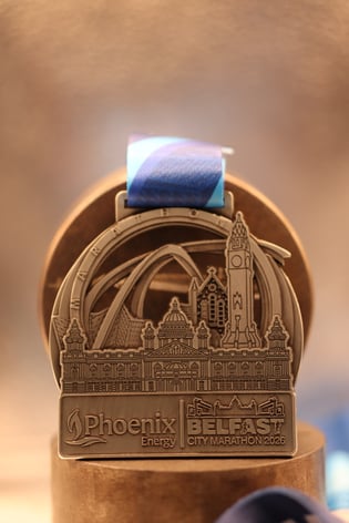
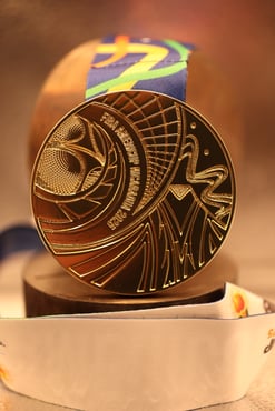
Finish: The Light Tells the Story
Finish is one of the most powerful design choices, because it determines how the medal interacts with light.
The same design can feel completely different depending on plating:
- Polished finishes feel classic and celebratory
- Antique finishes add contrast and heritage
- Matte finishes feel modern and understated
- Dual finishes highlight key elements and add luxury
A great finish doesn’t just make the medal shine, it supports the mood of the event.
The finish is often the difference between “nice” and “wow.”
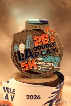
Typography: Less Text, More Impact
Text is important, but too much of it can overwhelm the design.
The best medals use typography with restraint:
Small type, cluttered wording, or overly decorative fonts can quickly make a medal feel busy.
When it comes to lettering, simplicity is usually the most premium choice.
A medal should speak visually first words should support, not dominate.
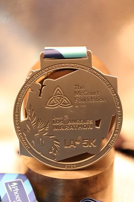
Front and Back: The Full Canvas Matters
Many designs focus entirely on the front, but the back of the medal is often just as important.
It’s an opportunity for:
People turn medals over. They photograph them. They keep them.
A thoughtfully designed reverse side makes the medal feel complete, not unfinished.
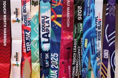
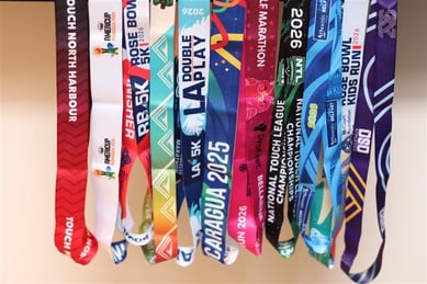
Ribbon Integration: The Medal Doesn’t End at the Metal
The ribbon is not an afterthought. It’s part of the design.
A great ribbon adds:
Sometimes the ribbon is what ties the entire piece together, literally and visually.
The best medals feel cohesive from top to bottom.
Meaning: The Most Important Element
Design isn’t just aesthetics.
The medals people cherish most are the ones that feel connected to the event:
- A local landmark
- A symbol of the challenge
- A story hidden in the details
- A design that feels earned
- A great medal doesn’t just look good.
It feels like it belongs to that moment.
A Medal Worth Keeping
At its best, a medal is more than a prize.
It’s a keepsake.
A story.
A physical reminder of effort and achievement.
The difference between an ordinary medal and an iconic one comes down to design choices, shape, depth, finish, balance, and meaning.
Because when someone receives a medal, they’re not just holding metal.
They’re holding a memory.